Use User Tasks and Forms
User Tasks are a key feature in BPMN (Business Process Model and Notation) workflows where human interaction is required to complete a process. In SpiffWorkflow, User Tasks are closely integrated with Forms, which are used to collect input or display information to users during process execution.
Some key features of user tasks are:
Involve direct interaction with the user.
Typically linked to a form for data collection or information display.
Can include custom validation and dynamic content.
Support task assignment to specific users or groups.
When to Use User Tasks:
To gather approvals or confirmations from users.
To collect data required for further process execution.
To provide users with critical information during a workflow.
Steps to Set Up a User Task
1. Add a User Task in the BPMN Model
Drag and drop the User Task symbol onto your BPMN diagram.
Connect it to the previous and subsequent tasks in the process flow.
2. Configuring the User Task Click on the user task in the BPMN editor to display the Properties Panel on the right. Below are the key sections and settings for user tasks:
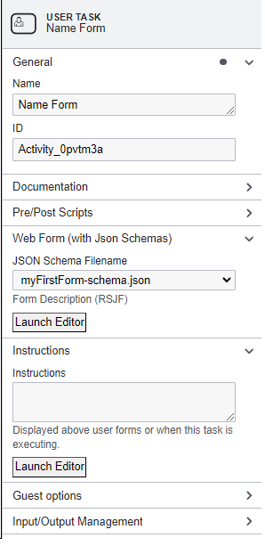
General
Name: Provide a meaningful name for the task (e.g., “Name Form”).
ID: Automatically generated or customizable unique identifier for the task.
Documentation
Add descriptions or notes to document the purpose of the task.
Pre/Post Scripts
Pre-Script: Add Python scripts to execute before the task starts.
Post-Script: Add Python scripts to execute after the task is completed.
Use the “Launch Editor” button to access the code editor.
Web Form (With JSON Schemas)
JSON Schema Filename: Select or define the form schema to be displayed during task execution.
Form Description (RJSF): Provide an additional description for the form.
Use the “Launch Editor” button to edit or view the schema, UI settings, or data.
Instructions
Add instructions that will appear above the form during task execution to guide the user.
Guest Options
Guest Can Complete This Task: Allow non-logged-in users (guests) to complete the task. This is useful for workflows requiring external inputs, such as surveys or public forms.
Guest Confirmation: Add a markdown confirmation message that appears after task submission.
Input/Output Management
Use the “Inputs” and “Outputs” sections to define specific variables accessible to or from the task. If not defined, all process variables are accessible.
Forms
Forms in SpiffWorkflow enable you to create intuitive user interfaces for collecting data during User Tasks. They are configured using JSON Schema and can be customized with dynamic elements, validations, and UI enhancements.
Let’s dive in and explore the possibilities of creating forms in SpiffArena.
Creating Forms
Here are the ways to create forms:
Using JSON Schema
JSON Schema is a standard for describing the structure of data in a JSON file. JSON Schema forms the foundation for building forms in SpiffArena.
To simplify the form creation process, we use the React JSON Schema Form (RJSF) library. RJSF is a powerful tool that uses JSON Schema as its basis. It enables you to create dynamic and interactive forms with ease. The RJSF library is open source, free to use, and follows the principles of open standards.
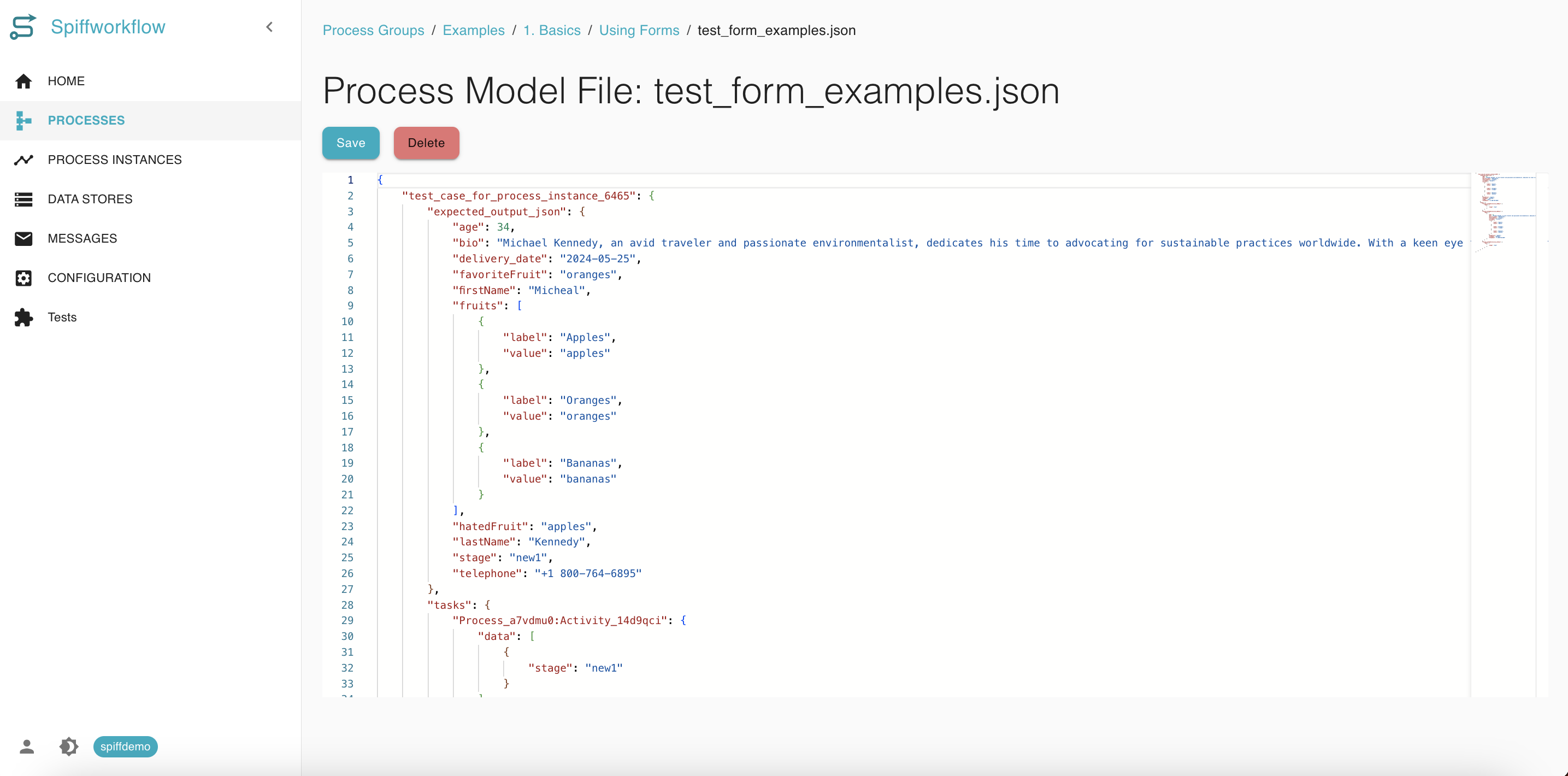
Please note that while this guide provides a basic understanding of JSON Schema and RJSF, there is much more to explore. We encourage you to refer to the official RJSF documentation for comprehensive details and advanced techniques.
Creating Forms from BPMN Editor
To create forms inside the editor, we utilize user tasks within the BPMN file. Upon creating a new BPMN file, open it to access the editor.
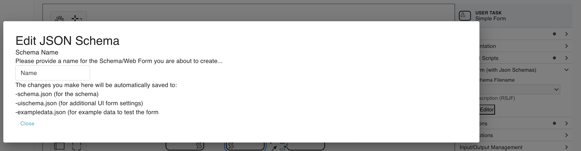
Start the Form Editor
In the editor, go to the “Web form” section. Navigate to the “Web form” and If starting from scratch, launch the editor and name your file (e.g., “demo”). After saving, it will automatically generate three essential files for us: a schema, UI settings, and some example data.
Understanding the Three Core Files
JSON Schema: This file describes the form. It allows you to define titles, property names, and more. As you make changes in this file, they will reflect in the form preview window. This schema outlines the properties or data points you aim to collect.
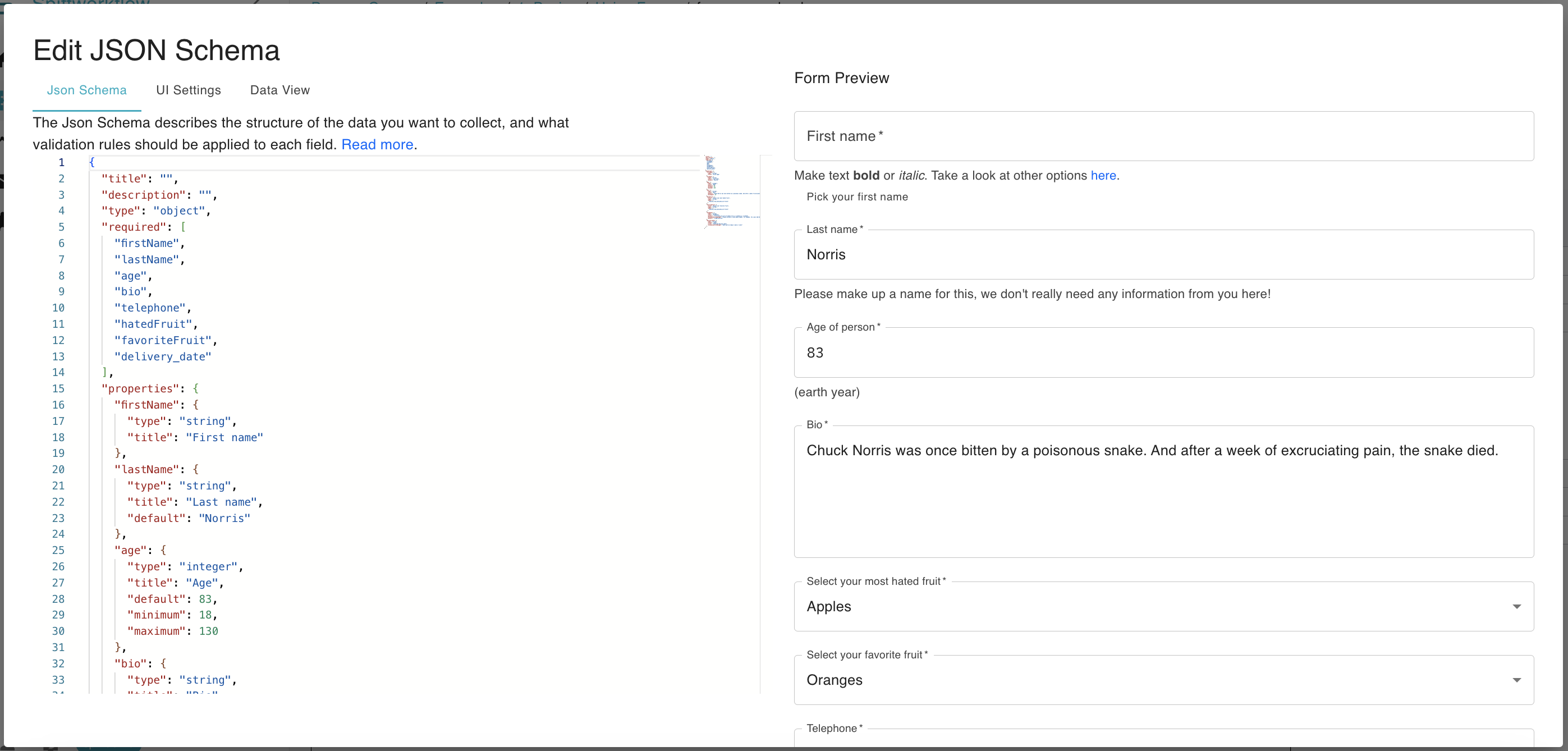
UI Settings: This file offers customization options for your form. You can edit descriptions, titles, and more. Changes made here are reflected in real-time on the form.
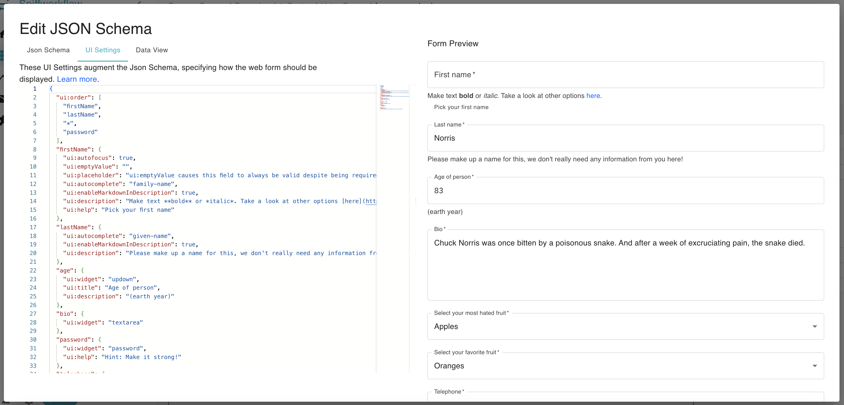
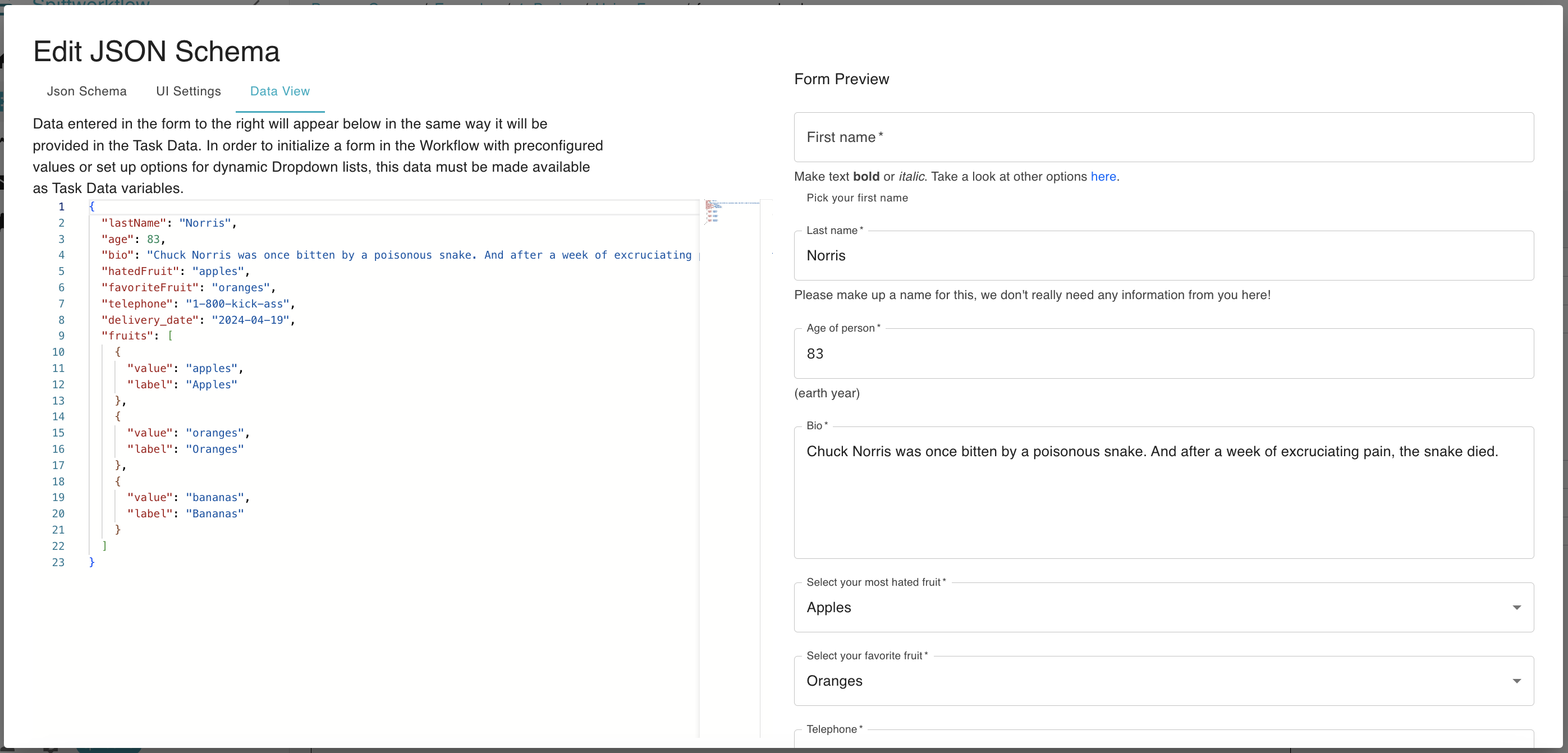
Data View: This section displays the data users input into the form. It provides a preview of what will be captured when the form is submitted. Both the data view and the form stay synchronized, ensuring consistency.
SpiffArena react-jsonschema-form enhancements
SpiffArena has enhanced the capabilities of react-jsonschema-form to provide users with more dynamic and flexible form-building options.
Dynamic Form Content with Jinja
Spiff Arena renders a User Task’s JSON Schema and UI Schema files through Jinja before parsing them as JSON. This means schema files can use task data to build dynamic titles, descriptions, enum choices, object properties, array item definitions, and UI schema settings.
This is the preferred pattern for dynamic form content.
Older schemas may use options_from_task_data_var:...; that pattern is deprecated and should not be used for new forms.
Use tojson whenever injecting strings, lists, dictionaries, booleans, or numbers into schema JSON.
The rendered output must be valid JSON.
The form builder’s Data View can be used to preview how task data affects the rendered schema.
For example, a Script Task can prepare options like this:
fruits = [
    {"value": "apples", "label": "Apples"},
    {"value": "oranges", "label": "Oranges"},
    {"value": "bananas", "label": "Bananas"},
]
Then the JSON Schema can render a dynamic dropdown from that task data:
{
  "title": "Dropdown List",
  "type": "object",
  "properties": {
    "favoriteFruit": {
      "title": "Select your favorite fruit",
      "type": "string",
      "anyOf": [
        {% for fruit in fruits %}
        {
          "type": "string",
          "enum": [{{ fruit.value | tojson }}],
          "title": {{ fruit.label | tojson }}
        }{% if not loop.last %},{% endif %}
        {% endfor %}
      ]
    }
  }
}
Jinja can also build dynamic object properties. For example, a Script Task can define the parcel ID fields that should be collected:
parcelID_fields = [
    {"name": "ward", "title": "Ward", "type": "string"},
    {"name": "lot", "title": "Lot", "type": "string"},
    {"name": "plot", "title": "Plot", "type": "string"},
]
The JSON Schema can render one property for each configured field:
{
  "title": "Parcel ID",
  "type": "object",
  "properties": {
    "parcelID": {
      "title": "Parcel ID",
      "type": "object",
      "properties": {
        {% for field in parcelID_fields %}
        "{{ field.name }}": {
          "title": {{ field.title | tojson }},
          "type": {{ field.type | tojson }}
        }{% if not loop.last %},{% endif %}
        {% endfor %}
      }
    }
  }
}
This pattern works for dynamic UI Schema settings as well. For example, a UI Schema can render readonly settings from task data:
{
  {% for field_name in readonly_fields %}
  "{{ field_name }}": {
    "ui:readonly": true
  }{% if not loop.last %},{% endif %}
  {% endfor %}
}
Deprecated dynamic form syntax
The options_from_task_data_var:... syntax is still supported for older process models, but use Jinja-rendered schemas for new work.
Jinja is more general, works in both JSON Schema and UI Schema files, and makes the final rendered schema easier to preview in the form builder.
Hiding Fields from Task Data
Spiff Arena can hide form fields by setting form_ui_hidden_fields in task data before the User Task.
Use dotted paths for nested object fields.
form_ui_hidden_fields = [
    "veryImportantFieldButOnlySometimes",
    "building.floor",
]
At runtime, Spiff Arena applies the equivalent UI Schema settings:
{
  "veryImportantFieldButOnlySometimes": {
    "ui:widget": "hidden"
  },
  "building": {
    "floor": {
      "ui:widget": "hidden"
    }
  }
}
Prefer Jinja-rendered UI Schema files when the visibility logic is complex or when the generated UI Schema should be explicit in the form source.
Formatted Number Widget
Use ui:widget: "formattedNumber" when users should enter numeric values with thousands separators while still submitting numeric data.
JSON Schema example:
{
  "title": "Amounts",
  "type": "object",
  "properties": {
    "amount": {
      "title": "Amount",
      "type": "number",
      "minimum": 0
    }
  }
}
UI Schema example:
{
  "amount": {
    "ui:widget": "formattedNumber"
  }
}
The widget displays 1234567.89 as 1,234,567.89.
For type: "number" or type: "integer" fields, the submitted value is numeric.
For type: "string" fields, the submitted value is an unformatted numeric string.
Use ui:options.decimals to limit decimal places and ui:options.allowNegative to explicitly allow or disallow negative values.
If allowNegative is not set, a schema with minimum: 0 prevents negative values.
Integer schemas reject fractional values.
{
  "amount": {
    "ui:widget": "formattedNumber",
    "ui:options": {
      "decimals": 2,
      "allowNegative": false
    }
  }
}
Calculated Fields
Use ui:field: "calculated" for read-only values that are computed from other form fields while the user edits the form.
Calculated values are included in submitted form data.
JSON Schema example:
{
  "title": "Country Totals",
  "type": "object",
  "properties": {
    "countries": {
      "type": "object",
      "properties": {
        "ARGENTINA": { "title": "Argentina", "type": "number" },
        "MEXICO": { "title": "Mexico", "type": "number" },
        "TOTAL": { "title": "Total", "type": "number" }
      }
    }
  }
}
UI Schema example:
{
  "countries": {
    "ARGENTINA": { "ui:widget": "formattedNumber" },
    "MEXICO": { "ui:widget": "formattedNumber" },
    "TOTAL": {
      "ui:field": "calculated",
      "ui:options": {
        "expression": "ARGENTINA + MEXICO",
        "format": "number",
        "decimals": 2
      }
    }
  }
}
Calculated expressions support +, -, *, /, and parentheses.
Field names resolve relative to the current object first.
Use $. to reference values from the root form data:
{
  "summaryTotal": {
    "ui:field": "calculated",
    "ui:options": {
      "expression": "$.countries.ARGENTINA + $.countries.MEXICO",
      "format": "currency",
      "currency": "USD",
      "decimals": 2
    }
  }
}
Empty strings, null, and missing numeric values are treated as 0.
Spiff Arena shows a warning if calculated fields do not stabilize, such as when two calculated fields depend on each other.
Checkbox Validation
Checkbox validation ensures that checkboxes, especially required boolean fields, are properly validated. By default, react-jsonschema-form only triggers validation when a checkbox field is left undefined.
This allows you to enforce validation for checkboxes with default values of false to support scenarios like “I have read the EULA” checkboxes.
To use checkbox validation, mark your boolean field required.
This will force the value to be true (the checkbox must be checked) before the form can be submitted.
Note
When working with both Python and JSON, be aware that True and False are capitalized in Python but must be lowercase (true and false) in JSON format.
Regex Validation
Regex validation allows you to validate text input fields based on regular expressions. This is useful when you need to ensure that user inputs match a specific pattern or format, such as email addresses or phone numbers.
In your JSON schema, include a pattern property with a regular expression pattern that defines the valid format for the input field.
Use validationErrorMessage on the schema property when the default validation message is not clear enough for end users.
{
  "email": {
    "title": "Email",
    "type": "string",
    "pattern": "^[^@]+@[^@]+\\.[^@]+$",
    "validationErrorMessage": "Enter a valid email address."
  }
}
JSON Text Validation
Use ui:options.validateJson: true when a string field should contain valid JSON.
The field is still submitted as a string.
Validation only checks that the value can be parsed as JSON.
JSON Schema example:
{
  "type": "object",
  "properties": {
    "payload": {
      "title": "Payload",
      "type": "string"
    }
  }
}
UI Schema example:
{
  "payload": {
    "ui:widget": "textarea",
    "ui:options": {
      "validateJson": true
    }
  }
}
Date Range Selector
The date range selector allows users to select a range of dates, such as a start and end date, within a form. You will use this feature when building forms that involve specifying date intervals.
Use a date range selector by creating a form field using the following structure:
Example for JSON schema:
    "travel_date_range": {
        "type": "string",
        "title": "Travel Dates",
        "pattern": "\\d{4}-\\d{2}-\\d{2}:::\\d{4}-\\d{2}-\\d{2}",
        "validationErrorMessage": "You must select Travel dates"
    },
Example for UI schema:
    "travel_date_range":{
        "ui:widget": "date-range",
        "ui:help": "Indicate the travel start and end dates"
    },
Date Validation
Spiff Arena supports minimumDate and maximumDate schema extensions for comparing date fields to today or to another field in the same form.
Minimum date validation
For instance, you can require that a date must be equal to or greater than another date within the form.
To implement date validation compared to another date, use your JSON schema and specify the date field to compare with using the
minimumDateproperty with a format likefield:field_name:start_or_end.start_or_endcan be eitherstartorend. You can choose to use “end” if the reference field is part of a range.
This is an example where the end_date must be after the start_date:
    "end_date": {
      "type": "string",
      "title": "End date",
      "format": "date",
      "minimumDate": "field:start_date"
    }
Maximum date validation
Maximum date validation in relation to another date allows you to set constraints on a date field to ensure that it falls on or before another specified date within the form. This type of validation is particularly useful for setting deadlines, end dates, or the latest possible dates that are contingent on other dates in the workflow.
To apply maximum date validation in your JSON schema, use the maximumDate property and specify the field to compare with, using the format field:field_name.
This ensures that the date chosen does not exceed the referenced field’s date.
Here’s an example where delivery_date must be on or before end_date:
"delivery_date": {
  "type": "string",
  "title": "Delivery Date",
  "format": "date",
  "maximumDate": "field:end_date"
}
If the referenced field is a date range, use field:range_field:start or field:range_field:end to specify which side of the range should be compared.
Using maximum date validation, you can prevent dates from exceeding a certain threshold, which is essential for managing project timelines, delivery schedules, or any scenario where the latest permissible date is a factor.
Date Validation Scenario: Enforcing Minimum and Maximum Date Constraints
Scenario Overview
Workflow processes often require the enforcement of minimum and maximum date constraints to align with operational timelines or project deadlines.
This scenario demonstrates the configuration of both minimumDate and maximumDate validations within a form, ensuring that selected dates fall within a specific period defined by other date fields in the workflow.
Handling Deserialized datetime Objects
When working with datetime values in SpiffWorkflow, it’s important to ensure that scripts correctly handle deserialized objects.
For example, here the current_time variable appears in Task Data as a dictionary:
{
  "current_time": {
    "value": "2025-02-13T18:54:08.261744-06:00",
    "typename": "datetime"
  }
}
However, during script execution, current_time is deserialized into a object rather than remaining a dictionary.
As a result, attempting to access current_time["value"] will cause an error.
The incorrect usage would be attempting to access current_time["value"] as if it were a dictionary:
cdt_datetime = current_time["value"].strftime('%Y-%m-%dT%H:%M:%S%z')
Therefore, use strftime() directly on the datetime object:
cdt_datetime = current_time.strftime('%Y-%m-%dT%H:%M:%S%z')
JSON Schema Configuration:
The “test-maximum-date-schema.json” process model outlines a form structure that includes fields for end_date, delivery_date, and delivery_date_range, each with constraints on the earliest and latest dates that can be selected.
{
  "title": "Date",
  "description": "Test Maximum Date",
  "type": "object",
  "properties": {
    "end_date": {
      "type": "string",
      "format": "date",
      "title": "End Date"
    },
    "delivery_date": {
      "type": "string",
      "title": "Preferred Delivery Date",
      "minimumDate": "today",
      "maximumDate": "field:end_date"
    },
    "delivery_date_range": {
      "type": "string",
      "title": "Preferred Delivery Date Range",
      "minimumDate": "today",
      "maximumDate": "field:end_date"
    }
  }
}
Field Descriptions:
End Date: The final date by which all activities should be completed.
Preferred Delivery Date: A single date indicating when the delivery of a service or product is preferred, bounded by today’s date and the
end_date.Preferred Delivery Date Range: A span of dates indicating an acceptable window for delivery, constrained by today’s date and the
end_date.
Implementation:
The schema enforces the following rules:
The
Preferred Delivery Datecannot be earlier than today (theminimumDate) and not later than theend_date(themaximumDate).The
Preferred Delivery Date Rangemust start no earlier than today and end no later than theend_date.
Display Fields Side-By-Side on Same Row
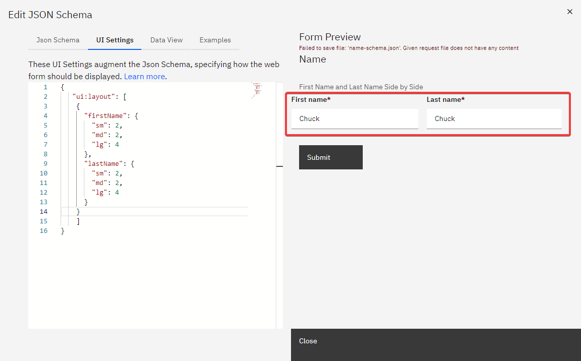
When designing forms, it’s often more user-friendly to display related fields, such as First Name and Last Name, side by side on the same row, rather than stacked vertically.
The ui:layout attribute belongs in the UI Schema for an object.
It arranges fields into rows and grid columns.
Form Schema Example:
Define your form fields in the JSON schema as follows:
{
  "title": "Side by Side Layout",
  "description": "Demonstrating side-by-side layout",
  "type": "object",
  "properties": {
    "firstName": { "type": "string" },
    "lastName": { "type": "string" },
    "notes": { "type": "string" }
  }
}
ui:layout Configuration:
The ui:layout attribute accepts an array of objects, each representing a conceptual “row” of fields.
Here’s how to use it:
{
  "ui:layout": [
    {
      "firstName": { "sm": 2, "md": 2, "lg": 4 },
      "lastName": { "sm": 2, "md": 2, "lg": 4 }
    },
    { "notes": {} }
  ]
}
Key Points:
Layout Design: The
ui:layoutspecifies thatfirstNameandlastNameshould appear side by side. Each field’s size adjusts according to the screen size (small, medium, large), utilizing grid columns for responsive design.Responsive Columns: Values (
sm,md,lg) indicate the number of grid columns a field should occupy, ensuring the form remains functional and visually appealing across devices.Simplified Configuration: If column widths are unspecified, the layout will automatically adjust, providing flexibility in design.
Complete Field List: Include every field that should render for that object. Fields omitted from
ui:layoutmay not appear where expected.
Example Illustrated:
In this setup, we’re arranging firstName and lastName to appear in the same row, as they are grouped in the first element of the ui:layout array.
We specify that firstName should occupy 4 columns on large displays, with lastName also taking up 4 columns, together filling the full row of 8 columns on large screens. For medium screens, the layout adapts to 5 columns, and for small screens, it adjusts to 4 columns.
By defining a uiSchema like this, the layout will automatically adjust the column widths for each screen size.
    {
      "ui:layout": [
        {
          "firstName": {},
          "lastName": {}
        }
      ]
    }
By using the ui:layout feature, you can design form layouts that are not only functional but also enhance the user experience, making your forms well-organized and accessible across various screen sizes.
Display UI Help in Web Forms
When designing web forms, it’s important to provide users with contextual help to ensure they understand the purpose and requirements of each field. This guidance can be achieved by adding help text to specific form fields.
To add help text to a web form field, use the following format:
"field_name": {
  "ui:help": "Your help text here"
}
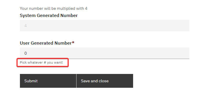
The text specified in the "ui:help" attribute will be displayed inside the form when the process starts, providing users with the necessary guidance.
Example:
Consider a form with two fields: form_num_1 and system_generated_number.
Here’s how you can add help text to the form_num_1 field and make the system_generated_number field read-only:
{
  "form_num_1": {
    "ui:autofocus": true,
    "ui:help": "Pick whatever # you want!"
  },
  "system_generated_number": {
    "ui:readonly": true
  }
}
In the example above:
The
form_num_1field will automatically be focused when the form loads (due to the"ui:autofocus": trueattribute).The help text “Pick whatever # you want!” will be displayed for the
form_num_1field.
Output:
By incorporating such help texts, you can enhance the user experience and ensure that users fill out the form correctly.
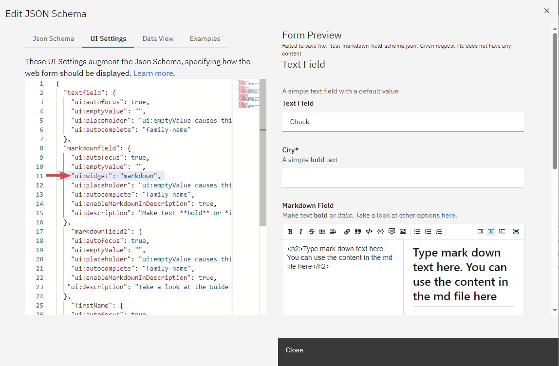
Markdown Widget for RJSF Forms
The Markdown Widget enhances RJSF forms by allowing users to input and preview markdown text directly within the form.
To incorporate the markdown widget into your RJSF form, follow these steps:
Create a Text Field: In your rjsf form JSON schema, define a standard text field where you want the markdown content to be entered.
Update the uiSchema: For the text field you’ve created, add the following line to its uiSchema to specify the markdown widget:
"ui:widget": "markdown"
Typeahead Widget
Use ui:widget: "typeahead" to search selectable records from a configured typeahead data source.
JSON Schema example:
{
  "title": "Location",
  "type": "object",
  "properties": {
    "city": {
      "title": "Select a city",
      "type": "string"
    }
  }
}
UI Schema example:
{
  "city": {
    "ui:widget": "typeahead",
    "ui:options": {
      "category": "cities",
      "itemFormat": "{name} ({state}, {country})"
    }
  }
}
The category option selects the typeahead data source.
The itemFormat option controls display text using keys from returned records.
The stored value is the selected record serialized as JSON.
If category is missing, the form displays an error for that field.
Numeric Range Field
The NumericRangeField component is a new feature in spiffworkflow-frontend that allows users to input numeric ranges.
This component is designed to work with JSON schemas and provides two text inputs for users to enter minimum and maximum values for a given numeric range.
JSON Schema Example
Below is an example JSON schema that includes the numeric range field:
{
  "title": "Compensation Search",
  "type": "object",
  "properties": {
    "compensation": {
      "title": "Compensation (yearly), USD",
      "type": "object",
      "minimum": 0,
      "maximum": 999999999,
      "properties": {
        "min": {
          "title": "Minimum Value",
          "type": "number"
        },
        "max": {
          "title": "Maximum Value",
          "type": "number"
        }
      }
    }
  }
}
The object must use min and max property names.
The top-level minimum and maximum values define the allowed bounds.
UI Schema Example
{
  "compensation": {
    "ui:field": "numeric-range"
  }
}
Validation
This will automatically validate that the max value cannot be less than the min value.
Repeating Sections in Forms
Nested forms or repeating sections are designed to collect an array of objects, where each object represents a set of related information. For instance, in a task management form, you might need to collect multiple tasks, each with its title and completion status.
This structure can be represented in the form’s schema as follows:
{
  "title": "Nested Form / Repeating Section",
  "description": "Allow the form submitter to add multiple entries for a set of fields.",
  "type": "object",
  "properties": {
    "tasks": {
      "type": "array",
      "title": "Tasks",
      "items": {
        "type": "object",
        "required": ["title"],
        "properties": {
          "title": {
            "type": "string",
            "title": "Title",
            "description": "Please describe the task to complete"
          },
          "done": {
            "type": "boolean",
            "title": "Done?",
            "default": false
          }
        }
      }
    }
  }
}
Form Preview:
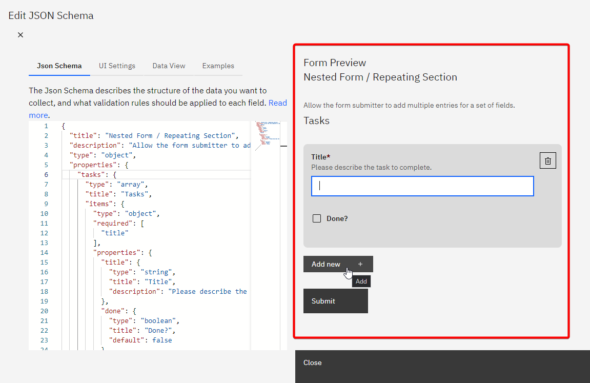
By using this feature, you can collect multiple related entries from users. RJSF automatically renders controls to add and remove items in the array.
Guest User Task
The Guest User Task feature in SpiffWorkflow enables non-logged-in users to complete designated Manual or User Tasks in a workflow. This improves accessibility and external engagement, allowing customers, applicants, vendors, or other third parties to participate in workflows without needing a Spiff account.
Key Features
Task Accessibility Guest users can complete human tasks marked with the “Guest can complete this task” option in the process model.
Direct Navigation via Link Guests access tasks through a dedicated public URL—no login or authentication is required.
Secure Session Behavior If a guest attempts to navigate away from the assigned task, they are redirected to the login screen to protect access boundaries.
Multiple URL Options Spiff supports:
Dynamic URL generation using the custom function
get_url_for_task_with_bpmn_identifier()Manual URL construction using the process instance ID and task GUID
Setup Instructions
1. Create a Process Model
Design your process to include a Manual or User Task.
In the task’s properties, check the Guest can complete this task box
(Optional) Configure:
Instructions (shown before submission)
Guest confirmation message (shown after submission)
Both support Markdown and Jinja
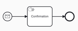
2. Start the Process with Incoming Payload
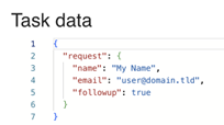
For example, a contact form on a website could initiate a process and pass in data like:
{
  "request": {
    "name": "My Name",
    "email": "user@domain.tld",
    "followup": true
  }
}
This data becomes available in the process’s Task Data.
3. Extend the Process for Guest Access
To send a link to the guest user:
Add a Script Task to build the link and email body
Add a Service Task (e.g., smtp/SendEmail) to send the email
Extended guest-enabled process:

4. Generate the Guest Link
Option A: Using get_url_for_task_with_bpmn_identifier() (Recommended)
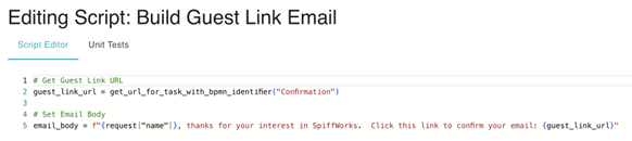
In the Script Task:
# Get Guest Link URL
guest_link_url = get_url_for_task_with_bpmn_identifier("Confirmation")

# Create Email Body
email_body = f"{request['name']}, thanks for your interest in SpiffWorks. Click this link to confirm your email: {guest_link_url}"
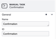
Make sure the task’s BPMN ID is set correctly:
Option B: Manual URL Construction
Use this format:
[domain]/public/tasks/[process_instance_id]/[task_guid]
Replace:
[domain]: your Spiff base URL (e.g., spiffdemo.org)[process_instance_id]: from the instance[task_guid]: from the specific human task
This method can be useful in test scripts, external systems, or fallback strategies.
5. Configure Email Delivery
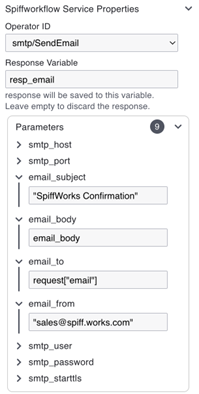
Use the smtp/SendEmail connector in a Service Task.
Example setup:
Operator ID:
smtp/SendEmailemail_subject:
"SpiffWorks Confirmation"email_body: the body from the previous Script Task
email_to:
request["email"]smtp_host, smtp_port, smtp_user,
smtp_password, smtp_starttls: set per your SMTP provider (e.g., MailTrap)
6. Enable and Customize Guest Task
In the Manual/User Task:
Enable: Guest can complete this task
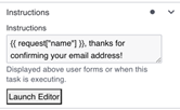
Add Instructions (before submit):
{{ request["name"] }}, thanks for confirming your email address!
Add Guest Confirmation (after submit):
We look forward to helping you find out more about SpiffWorks.
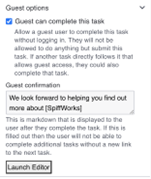
Example – “Be My Guest!” Flow
This example demonstrates how guest options allow an external user to confirm their email.
Process Steps
Message Start Event: Receives name/email from a form
Script Task: Builds guest URL and email body
Service Task: Sends confirmation email to the guest
Manual Task: Displays the confirmation screen to the guest
End Event
Email Sent to Guest
From: sales@spiff.works.com
To: user@domain.tld
Subject: SpiffWorks Confirmation

My Name, thanks for your interest in SpiffWorks.
Click this link to confirm your email:
https://spiffdemo.org/public/tasks/4184/8287e493-b590-4be2-9900-68ad84fcc3d4
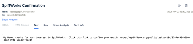
Guest Experience
Before Submit:
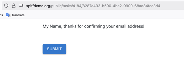
After Submit:

To verify that guest task access works as expected:

1. Start the process using a payload with email/name data
2. Check that the guest link is generated and sent via email
3. Open the guest URL in a **private/incognito** browser window
4. Confirm:

   * The task displays with instructions
   * The task can be submitted
   * The guest confirmation message appears

```{admonition} Note:
One guest link can allow multiple human tasks if they are sequential and marked for guest access. If a **Guest confirmation** message is present, it signals the end of guest interaction unless another link is sent. Combine with dynamic payloads and Jinja to customize experiences per user.